We Tried Google’s Nano Banana Pro Guide – Here’s What Actually Works
Google’s new Nano Banana Pro (Nano Banana 2) ships with an official prompting guide focused on story, subject, style, camera and text controls. In this article, we:
- Follow the official tips inside Lumabox
- Show you exact prompt patterns that worked best
- Compare how different settings change the final image
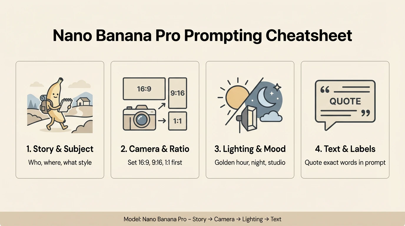
Create a clean 16:9 horizontal infographic titled "Nano Banana Pro Prompting Cheatsheet". Light background, dark text, flat illustration. Show four panels from left to right, each with an icon, short heading, and one-line caption: Panel 1 – icon of a character. Heading: "1. Story & Subject". Caption: "Who, where, what style". Panel 2 – camera icon and wide frame. Heading: "2. Camera & Ratio". Caption: "Set 16:9, 9:16, 1:1 first". Panel 3 – sun and moon icon. Heading: "3. Lighting & Mood". Caption: "Golden hour, night, studio". Panel 4 – text icon. Heading: "4. Text & Labels". Caption: "Quote exact words in prompt". At the bottom, add a footer bar: "Model: Nano Banana Pro – Story → Camera → Lighting → Text" in small sans
All the examples below are generated with Nano Banana Pro directly in the Lumabox workspace.
1. Start With a Clear Story: Subject, Composition, Action, Location, Style
The official guide recommends always defining:
- Subject – who or what is in the image
- Composition – how the shot is framed
- Action – what is happening
- Location – where the scene takes place
- Style – the visual treatment
In practice, that means moving from a vague idea like “a robot in a cafe” to a fully specified brief:
A stoic robot barista with glowing blue optics, wide shot, brewing a cup of coffee behind the counter in a futuristic cafe on Mars. Large windows show the red Martian landscape outside. Cinematic 3D render, soft atmospheric lighting, subtle lens bloom, detailed reflections in the coffee machine.
When we tried this pattern with Nano Banana Pro, we found:
- Adding action (what the subject is doing) dramatically reduces weird poses
- Explicit composition (close-up vs wide, portrait vs landscape) makes framing more consistent
- Location + style together help Nano Banana Pro understand whether you want realism, illustration or something in-between
Example 1
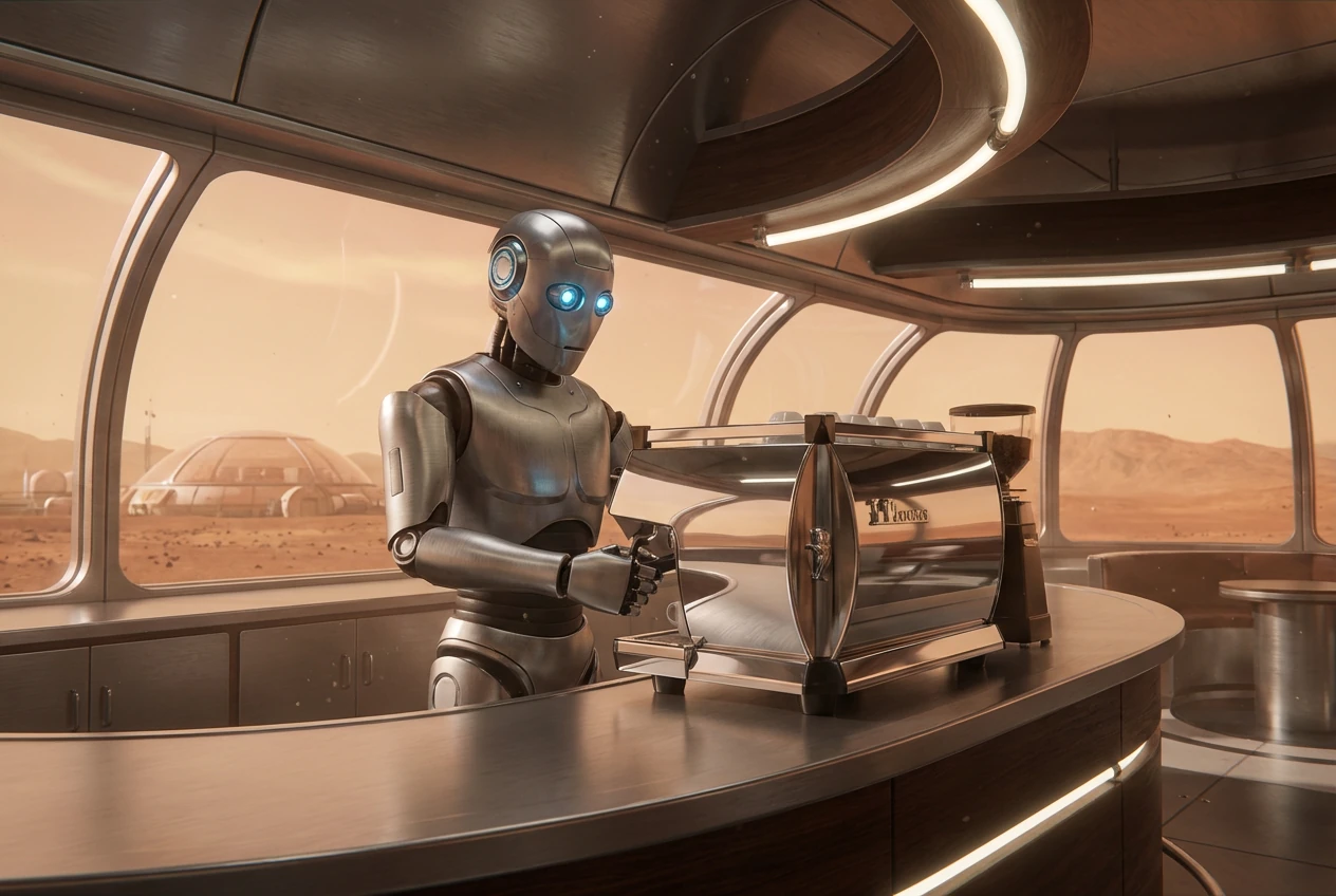
A stoic robot barista with glowing blue optics, wide shot, brewing a cup of coffee behind the counter in a futuristic cafe on Mars. Large windows show the red Martian landscape outside. Cinematic 3D render, soft atmospheric lighting, subtle lens bloom, detailed reflections in the coffee machine.
Example 2
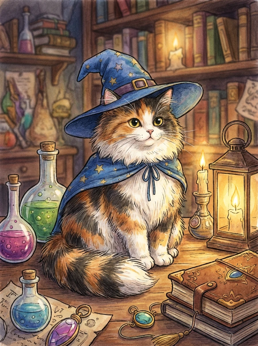
A fluffy calico cat wearing a tiny wizard hat and cloak, medium close-up portrait, sitting on a wooden table covered with potions and spell books in a cozy alchemist library. Warm candlelight, shallow depth of field, whimsical storybook illustration style.
Example 3
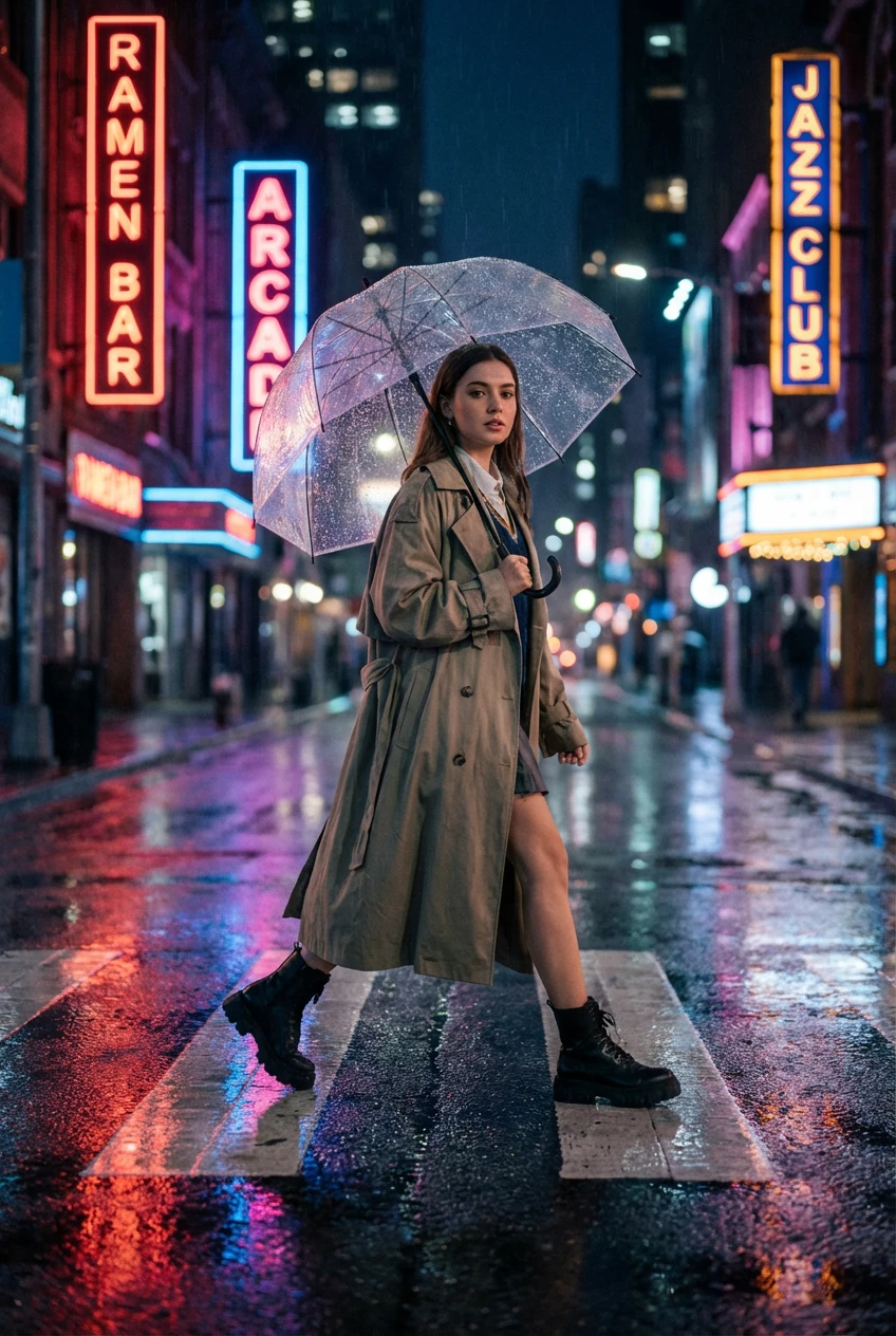
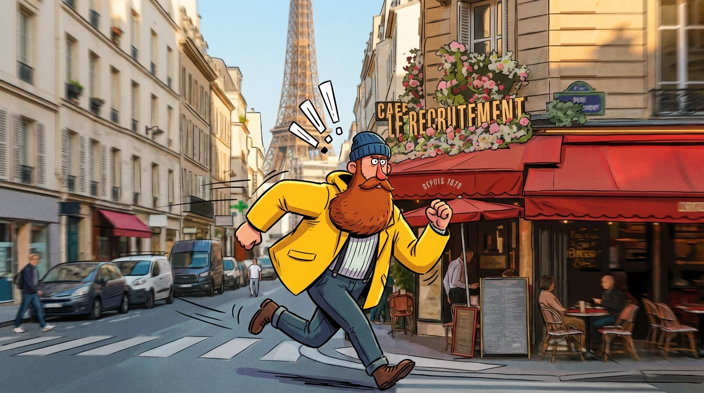
A street-style fashion portrait of a young woman mid-stride crossing a rainy city street at night, holding a transparent umbrella. Neon signs reflected on the wet pavement, wide shot, cinematic 3D photorealistic style, soft bokeh lights in the background, modern editorial fashion photography aesthetic.
How to use this in Lumabox:
- Model:
Nano Banana Pro - Mode: Text-to-image for fresh compositions, Image-to-image when editing a base photo
- Prompt structure:
- Line 1: Subject + action
- Line 2: Composition + location
- Line 3: Style + mood
2. Professional Control: Aspect Ratio, Camera and Lighting
Google’s guide pushes you to “direct the shot like a cinematographer” – and Nano Banana Pro responds extremely well to this.
When we added aspect ratio + camera + lighting into the same prompt, we saw:
- More intentional framing (e.g. 9:16 posters vs ultra-wide 21:9 scenes)
- Better depth of field and foreground/background separation
- More consistent mood across a set of images
Example prompt pattern we like:
- Composition & ratio: “cinematic 21:9 wide shot”, “vertical 9:16 poster”, “tight 3:4 portrait”
- Camera: “low-angle shot with shallow depth of field (f/1.8)”, “overhead product shot”
- Lighting: “golden hour backlighting”, “studio softbox lighting”, “neon rim light from the side”
Example 1
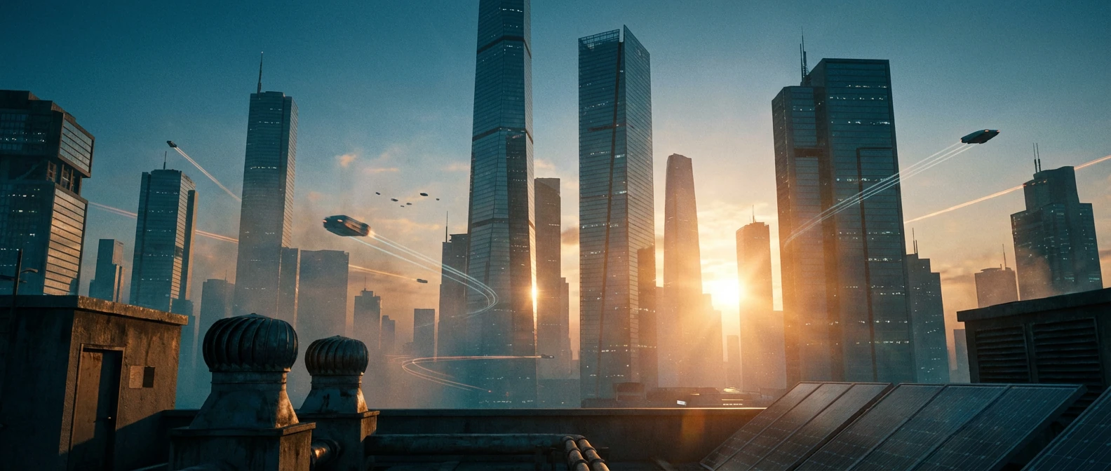
A cinematic 21:9 wide shot of a futuristic city skyline at blue hour, viewed from a rooftop. Low-angle camera pointing slightly upward toward towering glass skyscrapers, soft haze in the distance. Golden hour backlighting from the setting sun, subtle lens flares, cinematic color grading with muted teal and orange tones.
Example 2
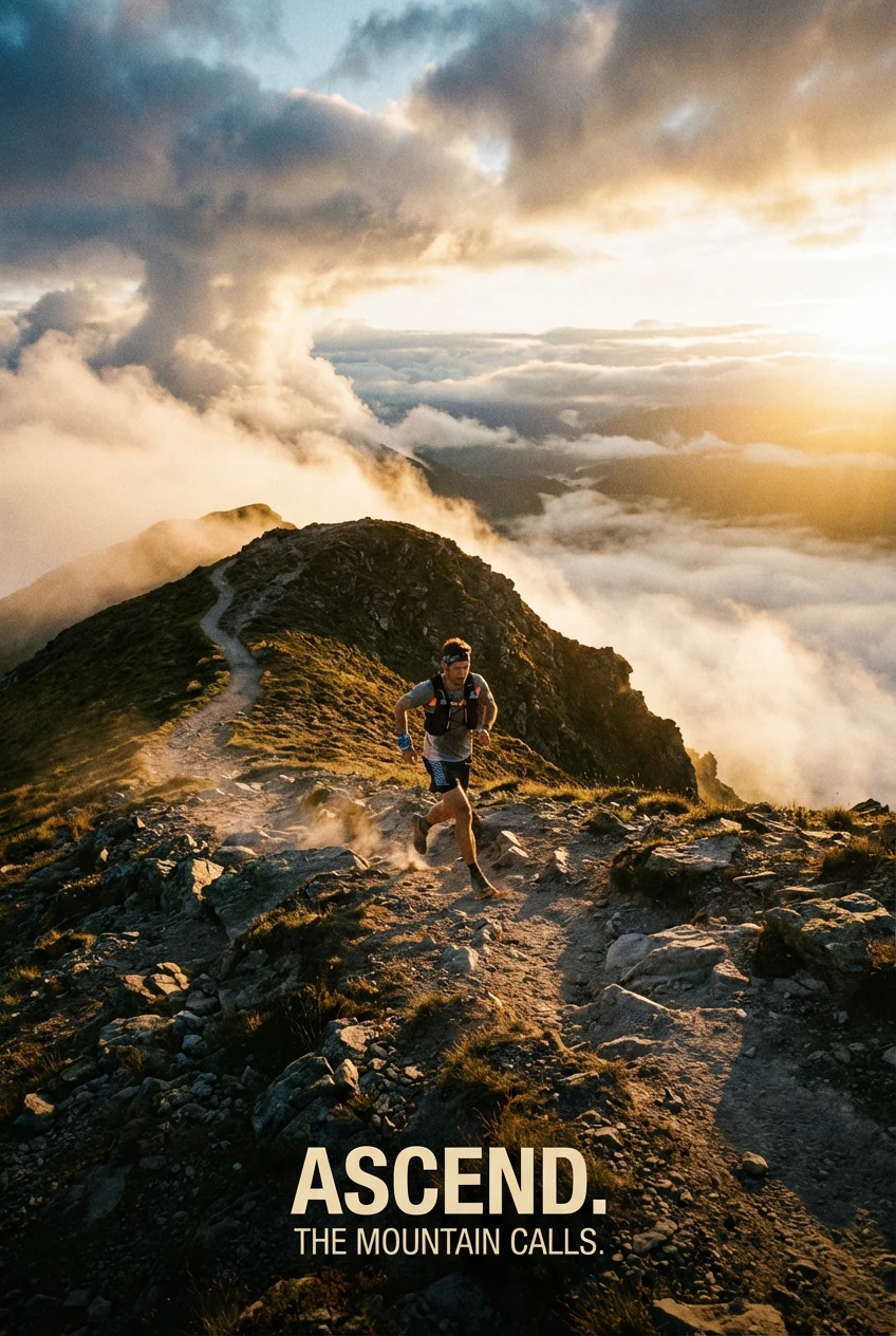
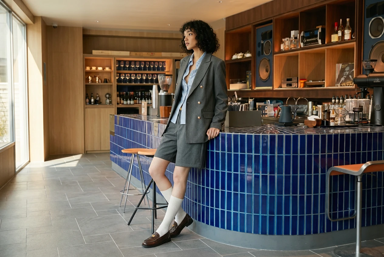
A vertical 2:3 poster of a trail runner on a mountain ridge at sunrise, viewed from slightly above. Strong leading lines along the path, dramatic clouds in the background. Warm golden light from the side, soft mist in the valley, high-contrast outdoor photography style.
How to apply in Lumabox:
- Pick
Nano Banana Proand set your aspect ratio (1:1, 4:5, 2:3, 21:9, etc.) first - In your prompt, add a separate clause for:
- Camera: angle + lens feel (wide, telephoto, macro)
- Lighting: time of day or studio setup
- Reuse the same camera + lighting line across a whole series to keep a consistent look
3. Text Rendering: Posters, Diagrams and Product Mockups
One of the biggest upgrades in Nano Banana Pro is text rendering. Google’s guide frames this as “sharp, legible text for posters and diagrams,” and our tests confirmed that:
- Short, all-caps headlines work best
- Simple sans-serif fonts are the most reliable
- Keeping text in one or two positions (e.g. top headline + small label) reduces spelling mistakes
Prompt pattern we used for posters:
A bold cinematic 16:9 movie poster of a night-time city skyline in the rain, neon reflections, dramatic lighting, photorealistic.
The headline "URBAN EXPLORER" rendered in bold white sans-serif font across the top. Small tagline at the bottom in subtle white text.
Example 1
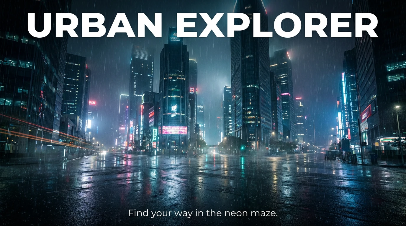
A bold cinematic 16:9 movie poster of a night-time city skyline in the rain, neon reflections on the wet streets, dramatic lighting, photorealistic style. The headline "URBAN EXPLORER" rendered in bold white sans-serif font across the top of the image. A small tagline at the bottom in subtle white text: "Find your way in the neon maze." Keep the text sharp, legible, and high contrast against the background.
Example 2
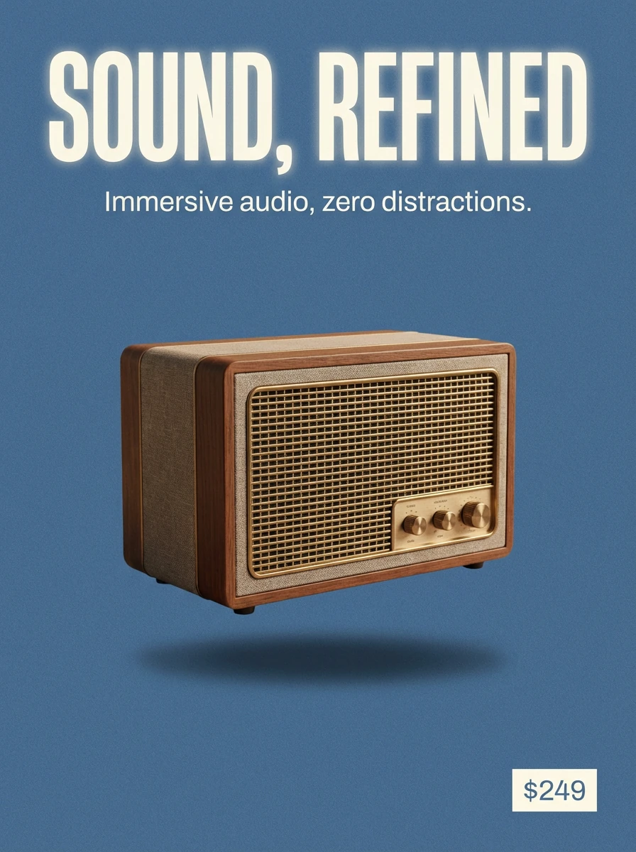
A clean 3:4 product launch poster for a retro style wireless speaker, centered on a solid muted blue background with visible film grain. Soft studio lighting with gentle shadow under the product. The headline "SOUND, REFINED" in bold uppercase sans-serif font at the top, pure white with glowing edge. A short subheading in smaller white text under the headline: "Immersive audio, zero distractions." Place a small price tag "$249" in the bottom-right corner in a subtle but legible font.
Tips that matched the official guide (and worked in Lumabox):
- Always quote the exact text you want rendered
- Describe font style + color + position in one clear sentence
- Avoid asking for long paragraphs of copy inside the image – keep it to headlines and short labels
4. Real-World Knowledge: Diagrams and Accurate Visuals
Because Nano Banana Pro is built on top of a reasoning model, the official guide encourages using it for explanatory visuals like diagrams and infographics – as long as you give clear factual constraints.
In our tests, this worked well for:
- Simple step-by-step infographics (e.g. recipes, how-tos)
- Cross-section diagrams where proportions matter
- Light data visualizations as supporting graphics
Prompt pattern that performed well:
Create an infographic that shows how to make elaichi chai, in four clear steps, with simple icons and minimal text, warm beige background, clean flat illustration style.
Example 1
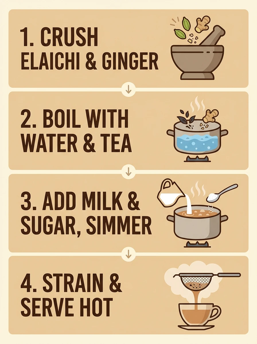
Create an infographic that shows how to make elaichi chai in four clear steps. Use simple icons and minimal text for each step, with a warm beige background and a clean flat illustration style. Ensure the sequence is logically accurate for the recipe preparation. Keep all labels large and easy to read.
Example 2
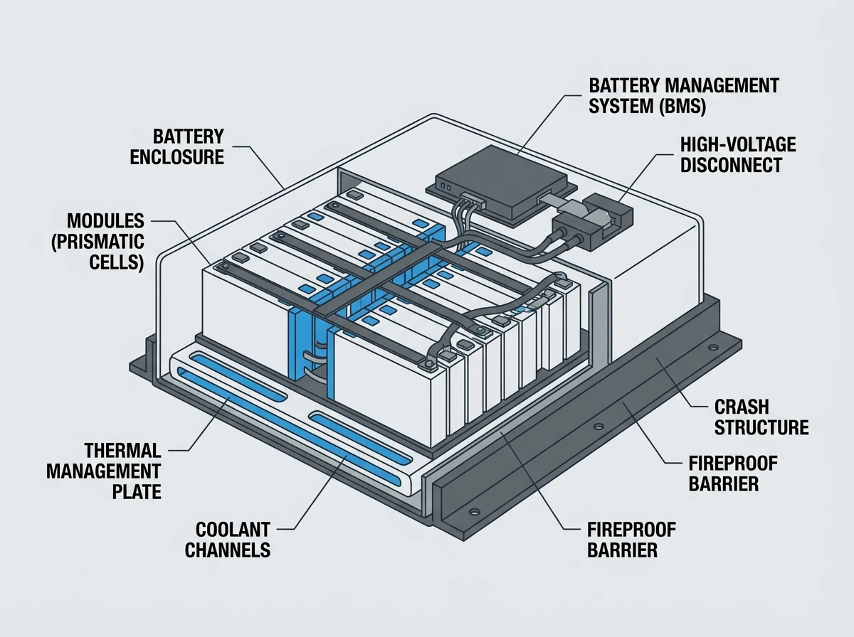
Create a scientifically accurate cross-section diagram of a modern electric car battery pack, labeled with the main components. Minimalist flat illustration style, light grey background, dark grey lines and shapes, blue accents for key parts. Ensure the proportions and basic structure are realistic, and keep all text labels high-contrast and legible.
When accuracy matters, add lines like:
- “Ensure the proportions are scientifically accurate”
- “Keep all labels easy to read with high contrast text”
We still recommend checking the results manually before using them in production materials.
5. Translate and Localize: Same Design, New Language
The official guide highlights multilingual text and localization. Inside Lumabox, Nano Banana Pro handled:
- Translating short English labels into another language
- Keeping layout, colors and imagery the same
Our best results came from uploading an existing design and giving Nano Banana Pro very specific instructions:
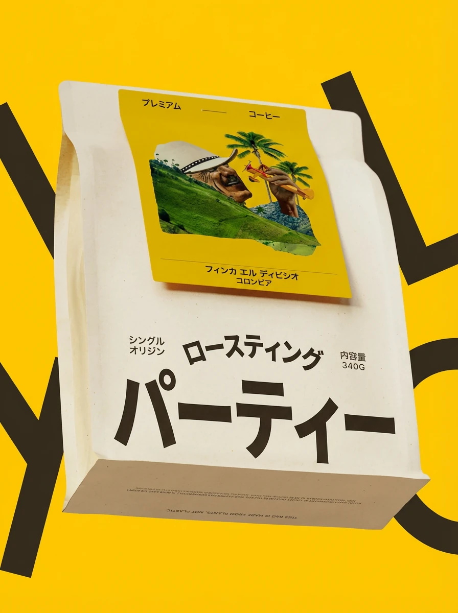
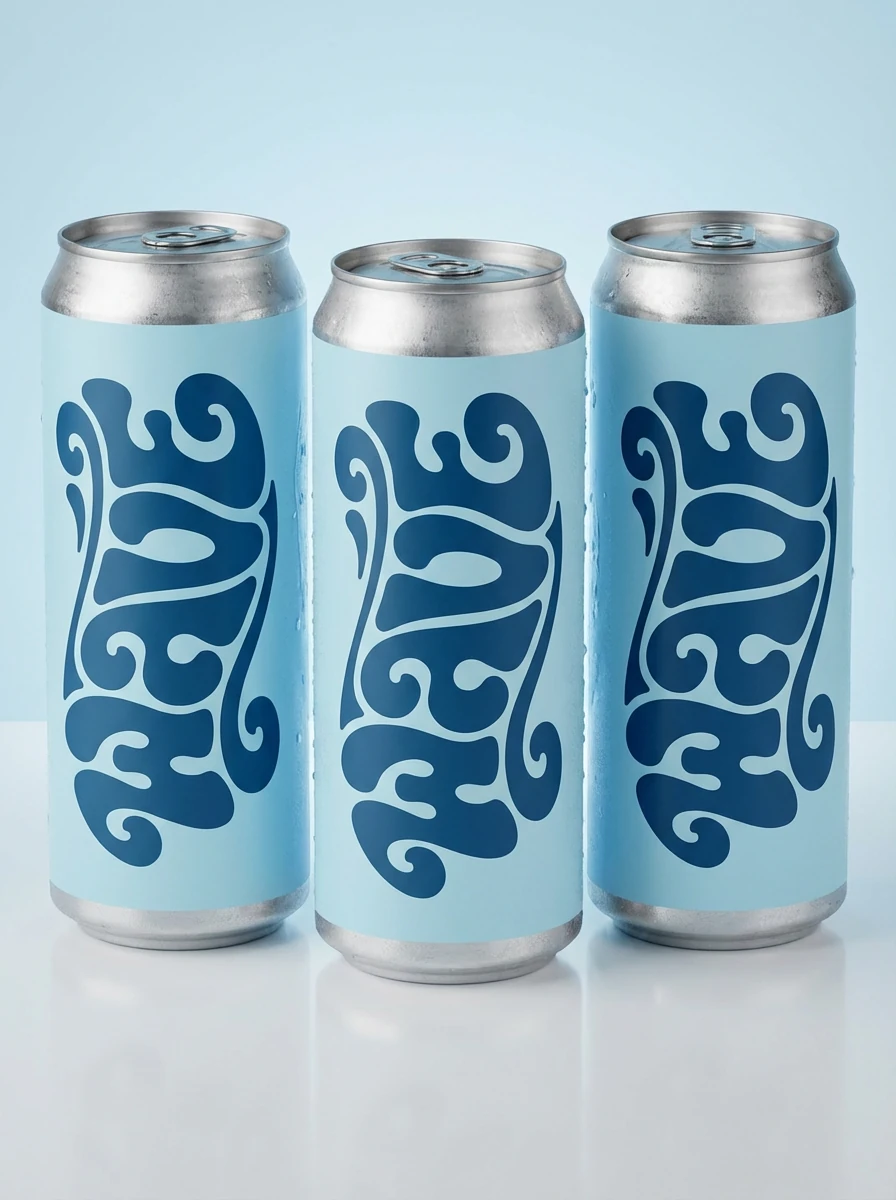
Translate all English text on the three yellow and blue cans into Korean, while keeping everything else the same. Keep the typography bold and legible.
Example 1


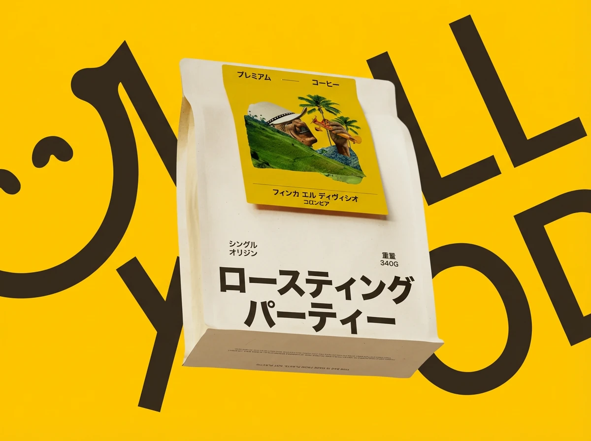
Translate all English text on this packaging into Japanese while keeping everything else exactly the same. Preserve the logo, colors, layout, icons, and illustration style. Keep the typography bold and legible, with similar font weight and hierarchy.
Example 2


Change only the main headline text on this poster into Spanish while keeping the background image, colors, layout, and small English tagline exactly the same. Maintain the same font style, size, and position for the headline so the design stays consistent.
Localization tips from our experiments:
- Use Image-to-image mode with your current design
- Be explicit: “Translate text only, keep layout, colors and logo untouched”
- For multi-region campaigns, generate one base layout, then run language variants one by one to keep visual consistency
6. Studio-Quality Edits and Lighting Changes
Google’s guide talks about “studio-quality control edits” – changing lighting, focus and grading while keeping the subject intact. With Nano Banana Pro:
- Turning a day scene into night is reliable when you are explicit about what stays the same
- Focusing on a particular object or area works well when you name it directly
Edit pattern that worked consistently:
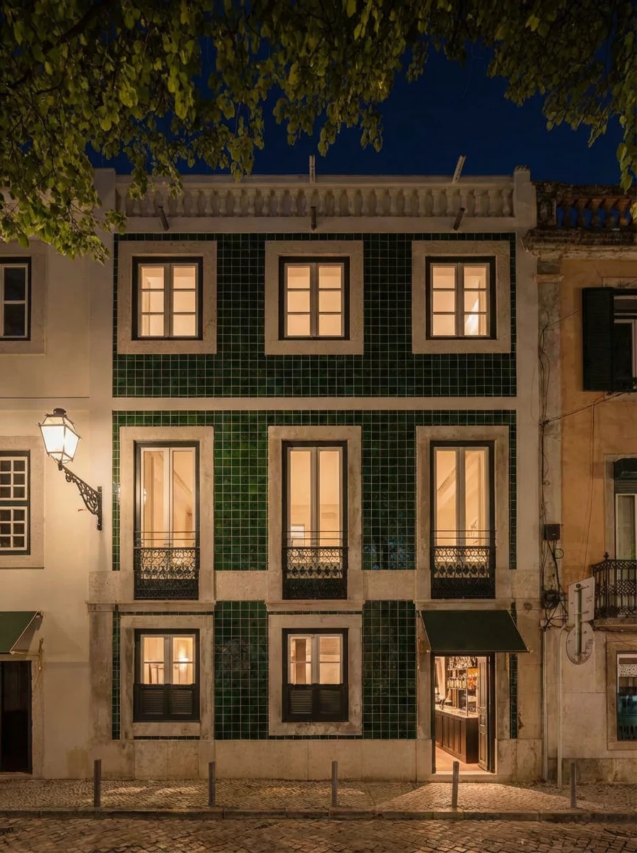
Turn this scene into nighttime while keeping the same composition and camera angle. Add soft warm interior lighting from the windows and subtle reflections on the floor.
Example 1


Turn this scene into nighttime while keeping the same composition, camera angle, and subject. Add soft warm interior lighting from the windows and subtle reflections on the ground. Darken the sky and surroundings realistically without losing important details in the architecture.
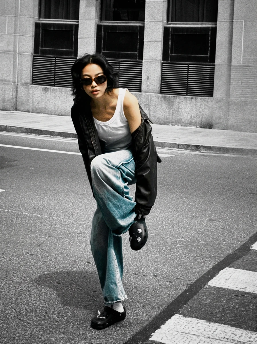
Example 2


Keep the subject and their clothing in full natural color, but desaturate the entire background to black and white. Do not change the composition, lighting, or any objects—only adjust the colors so the subject stands out in color against a monochrome environment.
For selective focus, phrases like “focus on the flowers” or “soft blur on the background only” help the model understand what should remain sharp.
7. Resize and Reframe: 1K, 2K, 4K Across Platforms
Nano Banana Pro makes it easy to re-use one concept across multiple aspect ratios and resolutions. This lines up perfectly with Google’s recommendation to “experiment with different aspect ratios and crisp 1K–4K output.”
Inside Lumabox, our favorite workflow is:
- Design once at a neutral aspect ratio (e.g. 3:2 or 4:5)
- Re-run the same prompt at 9:16, 16:9 and 1:1
- Use the 4K option only for final hero assets
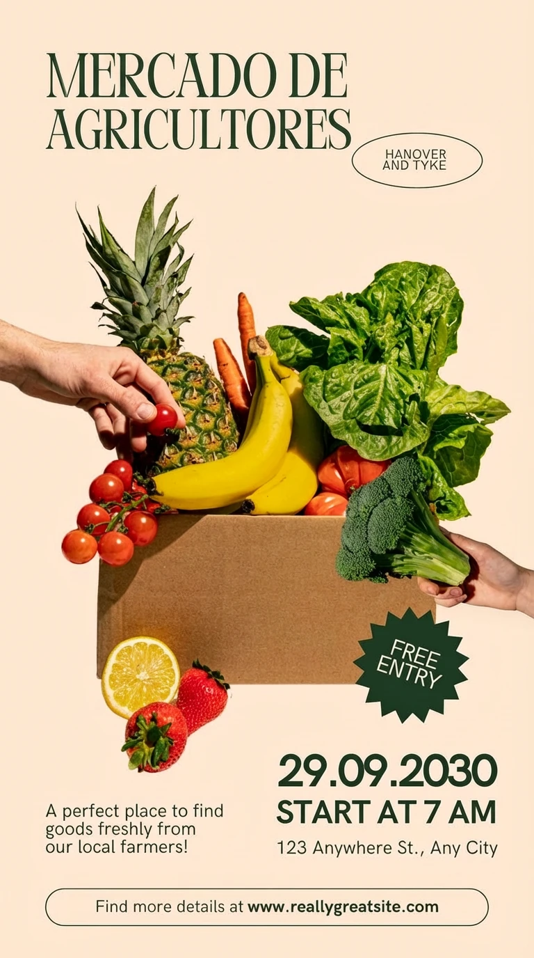
Converting a 3:4 poster to be 3:4 while translating its text
Translate all English text on this packaging into Japanese while keeping everything else exactly the same. Preserve the logo, colors, layout, icons, and illustration style. Keep the typography bold and legible, with similar font weight and hierarchy. Recreate the poster with the same content but a slightly altered layout for 4:3 ratio output
This gives you:
- Vertical social content (9:16)
- Wide website hero banners (16:9 or 21:9)
- Square posts (1:1) – all with a consistent look and feel
8. Blend Multiple Images and Keep Characters Consistent
One of the most powerful parts of the official guide is the ability to blend multiple images and keep character details consistent. In Lumabox, Nano Banana Pro handled:
- Combining mood boards, product renders and reference photos into a single layout
- Maintaining recognizable characters across multiple frames
We got the best results when we:
- Uploaded 2–4 key inputs instead of the maximum number every time
- Gave each image a role: “Image 1 – pose, Image 2 – art style, Image 3 – background”
- Asked Nano Banana Pro to “combine these images into one cinematic 16:9 composition”
Example 1


Combine these images into a single cinematic 16:9 storyboard frame. Use Image 1 for the main character’s pose and outfit, Image 2 for the illustration style and linework, and Image 3 for the background environment. Show the character running through the scene mid-stride, with motion blur on the background and sharper detail on the character. Keep lighting and color grading consistent across the whole image.
Example 2


Combine these images into a fashion lookbook spread in a 3:2 horizontal layout. Use Image 1 for the model’s face and body proportions, Image 2 for the outfit style, fabrics, and accessories, and Image 3 for the interior location and lighting. Keep the model recognizable across the image, with consistent facial features and hairstyle. Use soft natural window light and a clean editorial photography style.
This technique is especially strong for:
- Storyboards and comic panels
- Brand lookbooks where the same model appears in multiple outfits
- Product journeys showing a product across different scenes
9. Brand Systems: From Logo to Full Identity
The official tutorial ends with an identity system example – starting from a logo concept and expanding into a full set of mockups.
Nano Banana Pro is particularly good at:
- Keeping a consistent logo shape and color
- Applying it across billboards, packaging, apparel and digital screens
- Respecting lighting and material so the logo feels printed, stitched or painted rather than copy-pasted
Our two-step workflow in Lumabox:
-
Logo concept (Text-to-image):
- Describe the wordmark, style, and colors in detail
- Example: a smooth retro “WAVE” logo in a 1960s/70s psychedelic typographic style, light blue background and deep blue lettering
-
Identity mockups (Image-to-image):
- Upload the best logo result
- Ask Nano Banana Pro to generate one mockup at a time (e.g. billboard, bus stop, packaging, social ad) using that logo
The logo generation
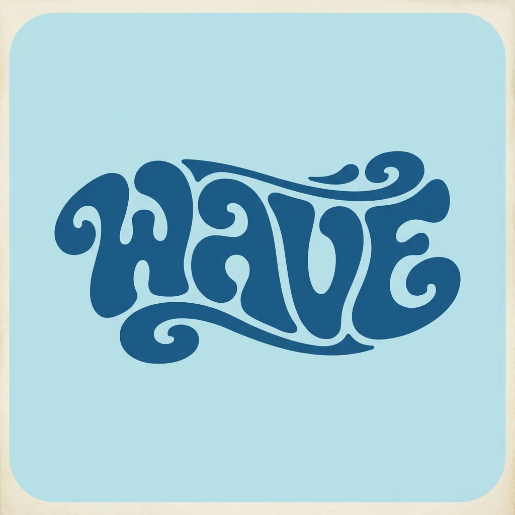
Create a smooth retro logo for the word "WAVE" in a graphic style inspired by vibrant, playful typographic illustration from the 1960s and 1970s. Use a groovy, psychedelic-inspired typeface with soft, rounded, and fluid letterforms. The letters should flow together to form a cohesive, wave-shaped silhouette, like a calligram where the word visually embodies a wave. Use a light blue background and a deep blue logo color, with a simple two-tone palette. The overall effect should feel nostalgic, bold, and approachable, with clean vector-style edges.
Putting the logo into a scene


Use this logo to create a 3:4 packaging mockup for a canned drink. Show three cans standing on a clean reflective surface, with the WAVE logo wrapped around each can on a light blue background. Keep the logo proportions and colors consistent. Use soft studio lighting to highlight the metallic texture and subtle condensation on the cans.
Running them one by one (instead of ten at once) gave us more control over each touchpoint while still keeping the brand feel unified.
10. Current Limitations and How We Work Around Them
Google’s guide also calls out some current limitations. In our own testing inside Lumabox, we saw similar patterns:
- Small text and tiny labels can still be soft or misspelled
- Highly factual diagrams sometimes simplify details too aggressively
- Multilingual text may have grammar or nuance errors
- Complex blends can introduce subtle artifacts around edges or lighting
Our practical recommendations:
- Use Nano Banana Pro to get 90% of the way there, then fix small text or alignment in Figma/Photoshop
- For important data, add the numbers in your design tool, not inside the generated image
- Always keep a clean base logo or mark on hand, and ask Nano Banana Pro to integrate it rather than redraw it every time
Quick Nano Banana Pro Prompting Checklist
Before you hit generate in Lumabox, run through this:
- Model:
nano-banana-pro(Nano Banana 2) - Aspect ratio: Set first (1:1, 4:5, 2:3, 3:2, 21:9, 9:16, etc.)
- Prompt:
- Subject + action
- Composition + location
- Style + mood
- Camera + lighting
- Optional: quoted text, font style, position
- Mode:
- Text-to-image for new concepts
- Image-to-image for edits, localization, brand extensions
- Resolution:
- Standard for exploration
- 4K for final hero assets only
Workflow tip: Start with a rough version using the original Nano Banana model, then switch to Nano Banana Pro with the same prompt and aspect ratio for your final, polished image.
Where to Try These Nano Banana Pro Prompts
You can use all of the prompt patterns in this guide directly inside the Lumabox workspace.
- Open Workspace →
- Choose Nano Banana Pro as the model
- Copy any of the structures above and adapt them to your own brand, product or story
Or use the composer on the right side of this page, by clicking on the replicate or copy prompt button on the example images.
For more details on when to choose Nano Banana vs Nano Banana Pro, see the main model overview: